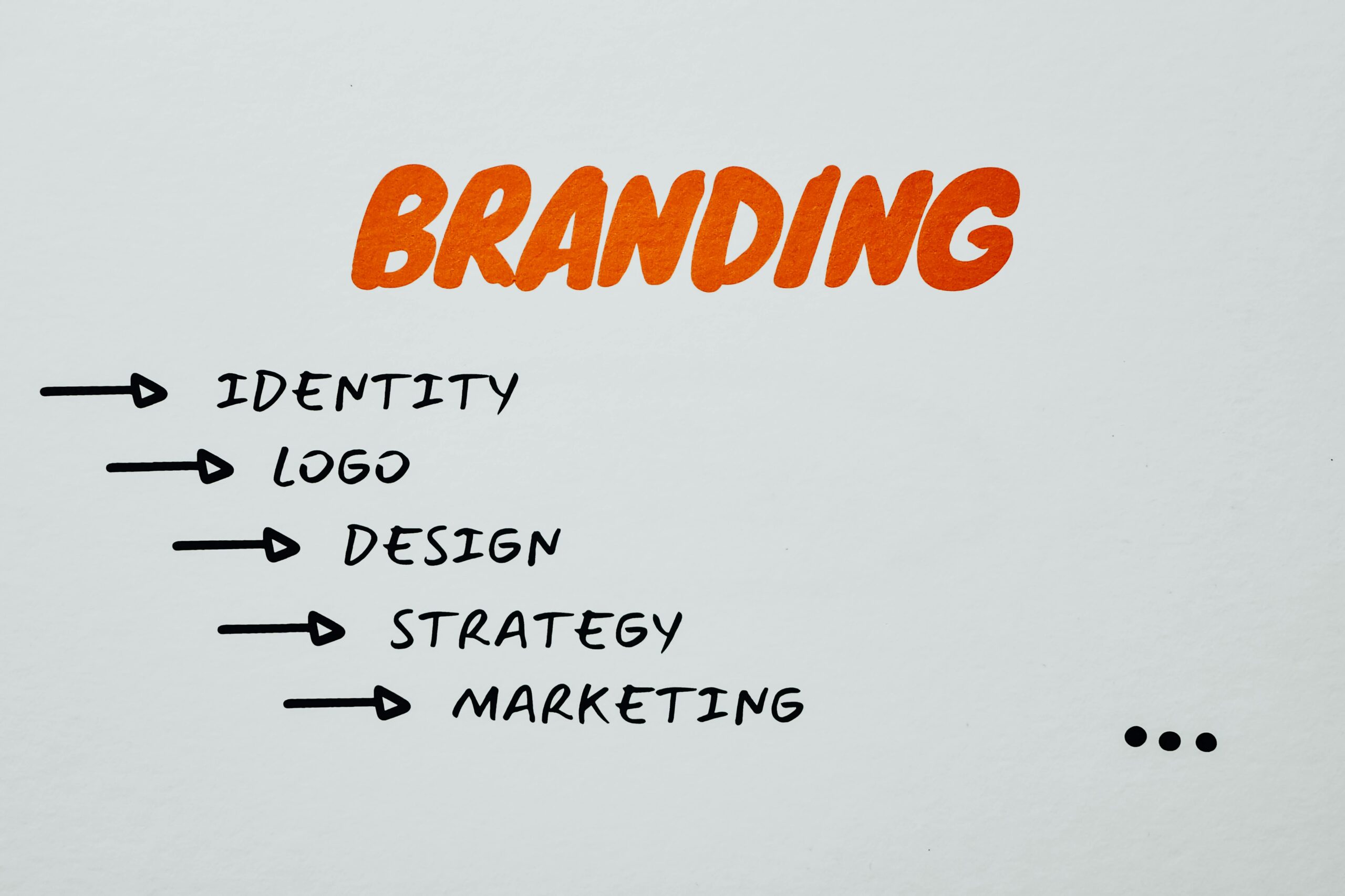
Q: What is AI-driven logo design and why should small businesses care?
A: AI-driven logo design uses artificial intelligence combined with digital marketing insights to generate professional-looking logos quickly and affordably.
AI-driven logo design means using AI tools and data to create a “cool” logo that fits your brand. With digital marketing and AI, even small businesses can leverage smart algorithms to brainstorm and prototype logos without hiring an expensive designer. This approach saves time and money, and helps maintain a consistent brand identity across all marketing channels. For example, AI tools like ChatGPT can suggest logo ideas and brand concepts, while logo-generator apps turn those ideas into visuals. The upside is clear: cost-effective branding and rapid iteration. Key takeaways:
- Cost-effective: AI tools (like ChatGPT or free logo generators) can produce logo concepts at little to no cost (House Call Pro). This drastically cuts down the thousands of dollars often spent on custom design.
- Fast idea generation: AI can spit out many concept sketches or design variations in minutes, helping overcome creative blocks (House Call Pro). You get multiple drafts instantly instead of waiting weeks.
- Brand consistency: These tools often use templates and styles aligned with digital marketing trends, ensuring your logo matches your online presence. That means you can easily adapt the logo for social media, website headers, ads, and more, reinforcing brand recognition everywhere.
- Hands-on creativity: Even if you’re not a designer, AI platforms are usually easy to use. They guide you step-by-step so you can contribute to the design process. This empowers small business owners to stay involved in branding without needing graphic design expertise.
In short, AI logo design marries machine efficiency with marketing smarts. By using digital insights (like customer data or industry trends) as input, AI logos resonate better with target audiences. The result is a modern “cool” logo design that reflects your brand’s identity, created faster and cheaper than traditional methods (House Call Pro).
Q: How can free AI tools help small businesses design a cool logo?
A: Free AI tools make logo design accessible. Platforms like Canva or Adobe Express offer no-cost logo makers with AI features to help beginners craft custom logos easily (canva).
Many free tools combine template libraries with AI to streamline logo creation. For example, Canva’s Logo Maker provides a drag-and-drop editor and an AI Logo Generator that quickly creates unique logos tailored to your brand (canva). You simply enter your business name, pick a style, and Canva’s AI suggests a variety of logo designs. Similarly, Adobe Express’s free logo maker walks you through three easy steps: describe your idea, pick an icon, and customize the result (adobe). These tools are user-friendly and require no graphic design skills. Other free or freemium options include LogoMakr, Looka, Tailor Brands, and DesignEvo, which let you experiment with icons, fonts, and colors for free (often charging only for high-resolution downloads).
Key points for using free AI logo tools:
- Start with prompts: Even text-based AIs like ChatGPT can help. Ask ChatGPT for logo concept ideas or color-scheme suggestions based on your business. Then plug those ideas into a logo-maker.
- Choose templates wisely: Free tools come with thousands of templates. Select one close to your vision and let AI adjust it. For instance, search Canva for “vintage cafe logo” or “tech startup logo”.
- Experiment and iterate: Generate several logos, mix elements (like combining one icon with another’s color scheme), and refine until it feels right. The more you tweak, the more unique your final design.
- Use multiple tools: Don’t rely on a single app. Try Canva for one layout, then see what Adobe Express or another tool suggests. Each AI sees design a bit differently, giving fresh ideas.
In practice, start with a simple prompt in a free logo maker and use its AI suggestions as a jumping-off point. For example, enter your business name, industry keywords, and a style (e.g. “modern,” “minimal,” “hand-drawn”). The AI then generates dozens of logos. Pick the ones you like and customize colors, fonts, or icons. Remember, these tools are plug-and-play – they handle the complex design logic for you (DataCose).
Q: Which free AI marketing tools can boost your branding and content?
A: Besides logo creation, small businesses have free AI tools for nearly every marketing task. These range from content generation to analytics and design.
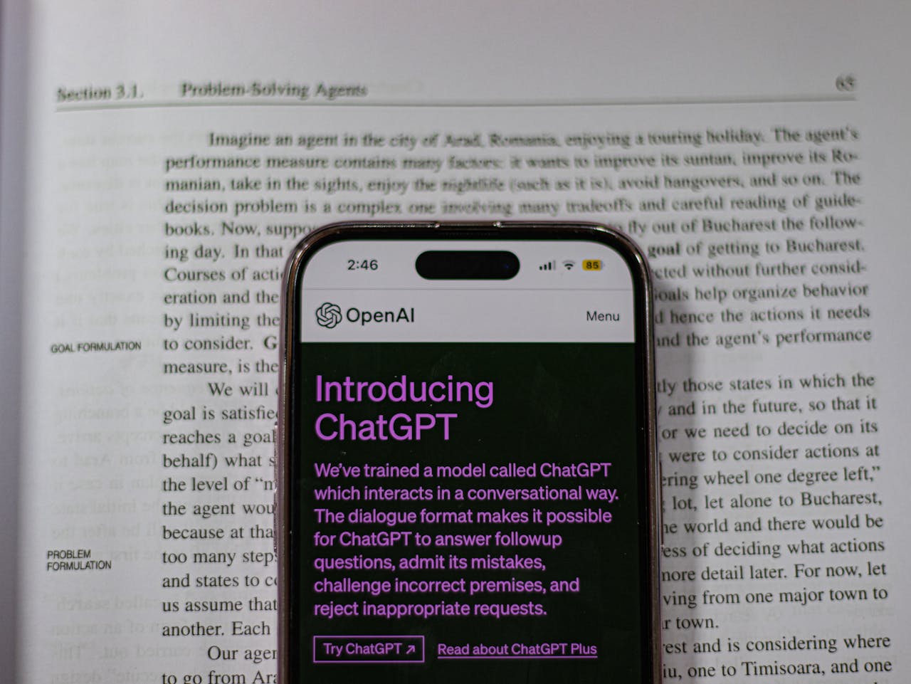
Many of the best free AI tools for marketing come with generous no-cost tiers. For content, ChatGPT (free version) is invaluable: it can draft blog ideas, social media captions, ad copy, or even business plans. It levels the playing field by giving startups capabilities that only large companies had before (leadpages). For data and SEO, Google Analytics now has AI insights that automatically highlight trends in your traffic and customer behavior, helping you target the right audience with your new logo and branding. Tools like AnswerThePublic (free tier) generate trending keyword insights for any topic, guiding both design themes and content strategy. Canva itself offers AI in its design suite (e.g. “Magic Write” for content and design suggestion features) (leadpages).
Some notable free AI tools for marketing:
- ChatGPT by OpenAI: Generates natural-language content for blogs, emails, and even logo concept descriptions (leadpages). It can also answer customer queries and brainstorm branding ideas.
- Google Analytics (with AI Insights): Uses machine learning to spot patterns in your website data (leadpages). This helps you understand which types of visuals or messages resonate with your audience.
- Canva AI Design Tools: Offers an AI-driven logo generator and image enhancers for creating graphics (leadpages). Its templates ensure your logo and social posts look professional.
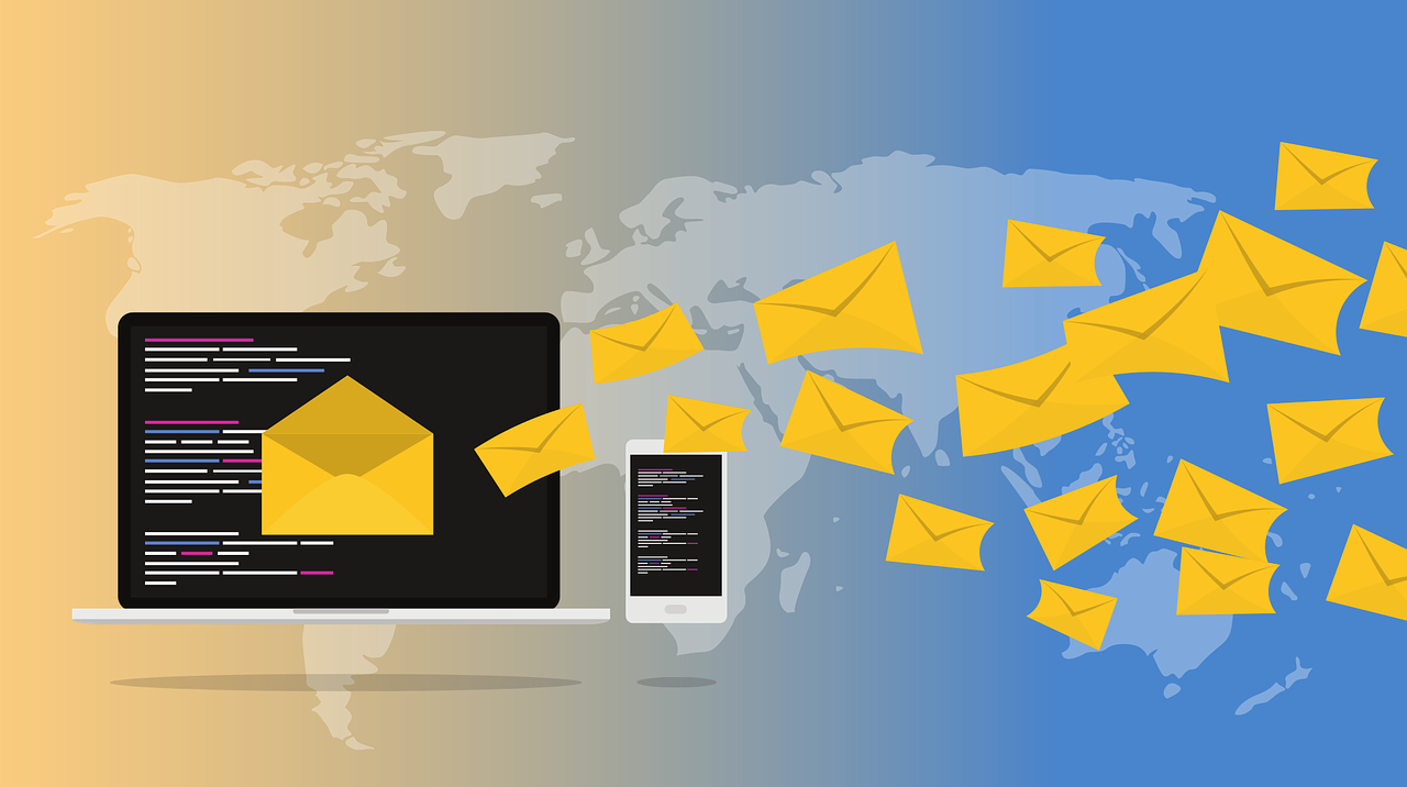
- Mailchimp’s Free Plan: Provides AI-powered suggestions for email subject lines and send times. These small optimizations improve engagement with your branded content.
- HubSpot CRM Free: Includes AI features like contact insights and email personalization, helping you tailor your marketing around your new branding.
- Hootsuite Free AI Scheduler: Analyzes your followers’ activity to schedule posts at peak times (leadpages). More eyes on your content means more brand visibility.
In addition, Leadpages notes that AI tools “streamline operations, enhance creativity, and boost productivity” without extra cost (leadpages). In practice, use a combination of tools: for example, write a blog post about your logo story using ChatGPT, design graphics in Canva, and analyze results with Google’s AI insights. The synergy of these free AI tools amplifies your branding across channels, making your marketing smarter and more data-driven.
Q: How can small businesses use digital marketing and AI to create a cool logo design?
A: By combining data-driven marketing with creative AI, businesses can craft logos that truly resonate with their audience.
Digital marketing and AI work hand-in-hand in branding. On one side, digital marketing research (SEO keywords, customer surveys, social listening) informs what imagery and tone will connect with customers. For example, AI-powered analytics might reveal that your audience loves vintage aesthetics or bold colors. You feed these insights into your logo-design prompts. On the other side, AI design tools handle the how of creation – automatically applying those styles to generate options. This synergy ensures the logo isn’t just cool-looking, but also on-brand and relevant.
Consider these points:
- Audience-driven design: Use AI to analyze customer preferences. For instance, an AI tool could scan social media trends in your industry, suggesting popular symbols or color palettes. Then tell your logo generator, “Include a mountain icon and earth tones” if your market shows an affinity for nature and outdoors.
- A/B testing with AI: Create multiple logo versions (with AI’s help) and test them in marketing campaigns. Digital marketing platforms can show each version to different audience segments. Use the AI-generated engagement data to see which logo gets the best response. The feedback loop ensures your “cool” logo is also effective.
- Consistent branding: Integrate your new logo into all marketing assets – website, social posts, ads, email headers. AI makes it easy to adapt the design to different formats (e.g. profile pictures, banners, video intros). This uniformity strengthens brand recall.
- Storytelling: A logo isn’t just an image, it’s the face of your brand story. Use AI (like ChatGPT) to create a brief tagline or brand narrative around the logo. Then incorporate that message in marketing copy. For example, if your logo symbolizes growth, highlight that theme in your campaigns.
In other words, think beyond the design itself. Leverage AI’s ability to process marketing data and automate design iteration. Use digital marketing and AI together: let AI crunch the numbers and trends, then apply creative flair. The result is a logo that not only looks cool but also hits the mark with your target customers, fitting seamlessly into your broader marketing strategy (aisinnovate).
Q: Are AI-generated logos professional and unique enough for business use?
A: They can be, but there are important caveats. AI logos often need refinement to ensure professionalism and originality.
AI logos have come a long way: they can look quite polished at first glance. However, small businesses should be aware of limitations:
- File and format issues: Many free AI logo makers export only raster images (PNG/JPG) rather than vector graphics. Rasters look fine on-screen but lose quality if scaled for large prints like banners. Some tools charge extra for vector (SVG/EPS) files. Always check what file types you get (housecallpro).
- Originality risks: AI models are trained on vast databases of existing logos. Sometimes they inadvertently create designs similar to a registered trademark or a famous brand. This poses legal and branding risks. As Housecall Pro warns, “it is entirely possible to wind up with a logo that is too close to one that has already been copyrighted”(housecallpro).
- Design limitations: AI often generates generic or expected visuals, lacking the nuance a human designer adds. The outputs might have odd proportions or mismatched styles (e.g. logo icon and text style might clash). These small inconsistencies can make an AI logo look unpolished if not fixed.
- Perceived quality: Some audiences might see an AI logo and (mistakenly) think the brand cut corners. If other parts of your marketing are high-end, a slightly “off” logo might undermine that premium feel.
In essence, AI logos are a great starting point, but rarely the final answer on their own. They can look professional, but to be safe:
- Double-check for copycats: Perform a reverse image search (Google or TinEye) on your AI-generated logo to see if any very similar logos already exist.
- Get it in the right format: If possible, use a tool or designer to convert the best AI logo into a vector file. This ensures crisp lines at any size.
- Compare with your industry: Make sure your logo isn’t too similar to competitors’ – you want to stand out, not blend in.
- Add the human touch: Many experts recommend the “best of both worlds” approach: use AI to iterate and generate concepts, but have a human designer finalize the chosen concept (housecallpro). A professional can tweak colors, align elements, and add unique details that only a human eye catches.
By following these steps, you ensure your AI-created logo is not only cool, but also professional, unique, and legally safe (housecallpro).
Q: How can small businesses avoid pitfalls when using AI for logo design?
A: Use AI for brainstorming, not as a shortcut to the finish line. Combine it with human checks to get the best results.
AI can generate ideas lightning-fast, but here’s how to sidestep common issues:
- Brainstorm first: Let AI handle ideation, then hand off to a human. For instance, use ChatGPT to list keywords and concepts (e.g. “modern, eco-friendly, techy”) and feed those into an image generator. The resulting sketches are drafts. Then involve a designer or a savvy friend to refine and polish the final choice (housecallpro).
- Check originality: Always verify that your AI-driven design is not inadvertently copyrighted. Use Google’s reverse image search or professional trademark services to ensure you’re not treading on someone else’s logo (housecallpro). Making small tweaks or mixing AI outputs can help differentiate your design.
- File upgrade: If the free tool only gives you a JPEG, consider commissioning a low-cost service (e.g. Fiverr, Upwork) to redraw the chosen logo in vector format. This one-time investment fixes any scaling issues and often yields a cleaner final file.
- Maintain brand voice: AI might suggest styles that look trendy but don’t fit your brand’s voice. If your brand is formal, avoid cartoonish AI designs. Stick to the mood board and branding guidelines you’ve set.
- Be transparent (optional): Some customers feel indifferent to AI logos, but others may prefer human-made designs. You could label versions as “AI-inspired” when soliciting feedback, so clients or followers know the origin. Honesty builds trust.
Ultimately, keep humans in the loop. As one expert put it, “Use AI to iterate and get ideas, then hire a designer to make it specific” (housecallpro). By iterating between AI and human creativity, you get all the speed of AI and all the care of a designer’s touch. This hybrid process yields a cool, professional logo safely.
Q: What are best practices for using AI in logo creation?
A: Give clear direction to the AI, iterate systematically, and always align the design with your brand identity.
To get the most out of AI tools:
- Start with a brand brief: Before touching AI, clarify your brand’s mission, values, and target audience. List adjectives (e.g. playful, elegant, bold) and any required icons or colors. This guideline ensures the AI focuses on your vision.
- Use detailed prompts: Don’t just say “create a logo.” Be specific: mention your business name, industry, and desired elements. For example: “Generate a modern logo for a coffee shop named ‘Roast & Co.’ using warm brown tones and a stylized coffee bean icon.” The more context, the better the AI results.
- Leverage keywords: Because we’re doing Generative Engine Optimization, sprinkle relevant keywords in your prompts. If you know terms your customers search for (like “organic,” “handmade,” or “vintage”), include them. This helps align the logo concept with audience expectations and SEO strategy.
- Mix and match: Often, no single AI output is perfect. Generate multiple versions, then combine the best parts. You might like the icon from one design and the font from another. Use the tools’ editing features to merge elements.
- Test different styles: Don’t stick to one aesthetic. Try minimalist, retro, futuristic, etc. Sometimes an unexpected style is the “coolest” option. AI lets you switch styles easily.
- Seek feedback: After refining a few candidates, show them to employees, friends, or loyal customers. Collect opinions on what feels most “on brand” and stands out. This human insight, combined with AI, guides you to the final selection.
- Keep files organized: Label each version (e.g. “V1_blueIcon,” “V2_handwrittenFont”) and note what’s good or needs fixing. This prevents confusion when returning to edit later.
Using these best practices, AI becomes an extension of your team rather than a gimmick. You gain the efficiency of automation and the precision of human strategy. The process looks like: research → AI generation → human review → iteration → finalize. Following this cycle ensures the “cool” logo you end up with is also a true reflection of your brand.
Q: How should small businesses implement an AI-designed logo in their marketing strategy?
A: Treat the new logo as the centerpiece of your brand identity. Roll it out consistently across all channels and link it to your marketing content.
A great logo does nothing on its own – it must be integrated into your overall marketing. Here’s how to put it into action:
- Update all channels: Replace old logos with the new one everywhere – website header, social media profiles, email signature, business cards, packaging, and signage. Consistency builds recognition, so use the exact same logo colors and proportions on every platform.
- Optimize for digital use: When adding the logo to your website or posts, use an SEO-friendly filename and alt text (e.g.
yourbusiness-logo.png, alt=”YourBusiness logo”). This ties your brand name (a keyword) into your SEO efforts. Also ensure the image is web-optimized (small file size without quality loss) so it loads quickly. - Leverage AI marketing tools: Continue the AI momentum by creating branded content. For example, use the logo in video intros with AI video editors (e.g. add your logo to an AI-generated social video), or include it in email templates powered by AI personalization. Superside notes that these AI workflows can deliver campaign-ready assets faster (superside) – for instance, generating multiple ad variations with your logo already embedded.
- A/B test audience reactions: If you’ve created a couple of logo variants, use digital marketing tools (like Facebook Ads A/B testing) to see which one performs better. Maybe a blue version gets more clicks than a red one, or a horizontal layout works better than stacked. Let data (and AI analytics) inform your final choice.
- Enhance brand storytelling: Use the logo as a storytelling element. If your logo features a tree, create content about growth or sustainability. AISInnovate emphasizes that AI tools let small businesses offer personalized customer experiences at scale (aisinnovate), so include your logo in targeted messages (like personalized postcards with the logo for loyalty program members).
- Gather feedback: After launch, monitor KPIs. Did website visits or social engagement increase? Run quick surveys asking new followers what they think of the updated logo. This feedback loop, supported by analytics, ensures the logo helps (and doesn’t hurt) your marketing goals.
Embedding the logo into every customer touchpoint makes it work for you. It becomes the visual handle that ties together your content, ads, and communications. When done strategically, your cool AI-designed logo can amplify your digital marketing efforts by making your brand more memorable and trustworthy.
Q: How can small businesses continue leveraging digital marketing and AI for branding beyond logos?
A: Logos are just the beginning. Use AI-powered marketing everywhere – in content, ads, customer service, and data analytics – to grow your brand intelligently.
Think of the logo as one pillar of your brand’s identity. AI and digital marketing can strengthen every other pillar as well. For example:
- Content and Social Media: AI writing tools (like ChatGPT or Jasper) can maintain a consistent brand voice across your blog, newsletters, and social posts. AI image and video generators (DALL·E, Midjourney, Lumen5) can produce visuals and videos featuring your logo and brand colors. Tools like Hootsuite AI or Buffer schedule posts at the best times and suggest content topics. All of these keep your brand visible and cohesive online.
- Advertising: Use AI for smarter ad campaigns. Platforms like Google Ads and Facebook Ads use AI to optimize who sees your ads (targeting based on behavior) and how much to bid. You can even use AI to generate multiple ad headlines or design variations (with your logo) and let the system pick the best performer. This automation maximizes ROI on your marketing budget.
- Customer Engagement: Implement chatbots (powered by AI) on your website to provide instant, on-brand support. When customers chat with the bot, it can use your logo in its interface and speak in the brand’s tone. This 24/7 service element boosts professionalism and keeps the brand experience consistent.
- Data-driven strategy: AI analytics platforms can continually analyze campaign data, segment customers, and predict trends. For instance, predictive AI might tell you which products (featuring the logo) are likely to sell well next season. You can use these insights to plan promotions or rebranding, staying ahead of market changes.
- Continuous learning: Finally, stay updated. AI tools evolve quickly. Encourage a mindset of experimentation: set aside a small budget or time each month to test a new AI feature or tool (like an AI email sender or voice-assistant integration). As AISInnovate notes, “small businesses with limited resources” can compete through AI automation and personalization (aisinnovate). By keeping pace, you ensure your brand not only looks current (with that cool logo) but also markets itself intelligently.
In summary, a cool logo designed with AI is a powerful asset, but it shines best when used within a broader AI-driven marketing plan. Combine that logo with smart AI marketing tools for content, analytics, and ads. This full-stack approach means every customer interaction – from seeing your logo in an ad to clicking through to your website content – is optimized by AI. The result is a strong, consistent brand presence that helps your small business grow, one AI-powered step at a time.
Q: Where can I find the best free AI tools and resources for marketing and design?
A: Start with well-known platforms and educational blogs. For design: check out Canva’s free logo maker or Adobe Express’s logo generator (canva). For strategy tips: read in-depth guides like Superside’s review of top AI logo generators (superside) or Leadpages’ blog on free AI marketing tools (leadpages). Also, explore courses and webinars on sites like the Digital Marketing Institute or blogs like Housecall Pro’s branding guide (housecallpro). These resources will keep you updated on new tools (free and paid) and best practices in digital marketing and AI.
Key Takeaways: Integrating Digital Marketing and AI transforms logo design and branding. Small businesses can now design a cool logo quickly and cheaply with free AI tools (e.g. Canva, Adobe Express)(canva). Use AI for idea generation and consistent branding across channels, but always refine the output – check file formats, originality, and polish with a human eye (housecallpro). Complement your logo with other AI-powered marketing (content creation, analytics, ads) to keep your brand smart and competitive (leadpages).
If You need any Help, contact Us!

Asperiores rerum consequatur molestiae enim possimus maiores.
Just Do it.